Open PDI Competition No. 4 was judged by David Lloyd LRPS. David travelled to us from the Dorking area and is a member of the United Postfolios of Great Britain organisation. He explained that this is a postal / online photographic organisation that ‘gathers’ for competitions and critique sessions, grouped into like minded circles of common interest. Perusal of their website will provide further information for those curious to know more. In particular, this writer found the “Tutorials” section of the site interesting – a compete page of links to post processing tutorials covering the principle software packages. Among them was a briefing on dealing with haloes on landscape images – very slick, but not of use for the particular haloes problem discussed during our session last week.
We had 36 images submitted, all to be judged in a single class. The images presented were either monochrome or colour, at the choice of the photographer. David gave us a brief talk on each image, discussing those parts of the picture he liked, and those parts he felt could be improved upon. He made many suggestions for possible changes that might be experimented with to improve the impact of the final image.
David’s comments were wide ranging, but a number of points came up multiple times, and these are set out below:-
- The composition of the image within the frame is most important, and a number of images did not excel at this critical step
- Leading lines, or recession, within the frame are a critical requirement to take the viewers eye into the image to the point where the photographer wants the eye to come to rest. A number of images could have been improved with more attention to this issue
- Tonal balance, or a well selected colour palette, can have a strong impact in the image, helping it to stand out from the competition
- Portraits, whether of people or animals, are often improved if the subject of the image is directly relating to the camera / photographer
- Inspect the image for bright distractions in the image, either too light or too strongly coloured, which can pull the viewers eye away from the main subject
At the conclusion of the first run through of the images some 15 had been held back for a second look. Of these we had seven images scoring 9 points, five scoring 9 ½ , and two tens
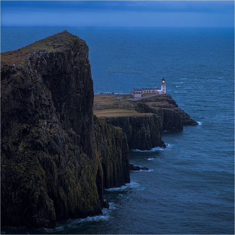
The first of the images scoring 9 ½ points was ‘Neist Point Spring Evening’ by Brian C, which is reproduced below. David Lloyd commented that the strong diagonal in the image worked well, and that the peak on the left half of the image being below the horizon was important for its success. He even felt that the white water showing on the seaward side of the lighthouse contributed to the success of the picture.
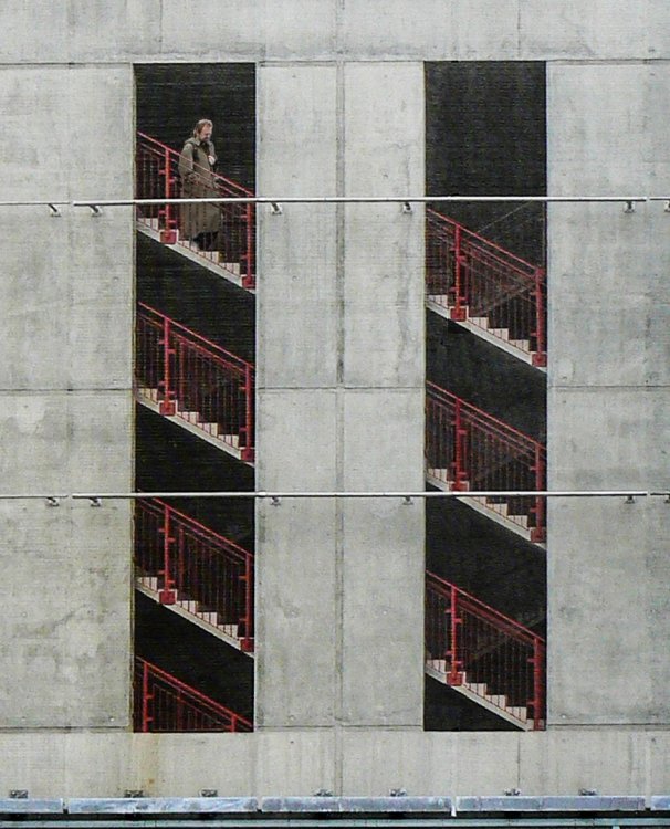
The second image scoring 9½ points was ‘Stadium Steps’, by Dave S , shown below. Our judge commented that photographers are drawn to this type of repeating pattern image. He further said that the person on the steps was effective. He did, however, suggest that the small amount of low wall in the foreground was less interesting than the main image, and that the colour change drew attention. Therefore this wall might have been better omitted from the picture.
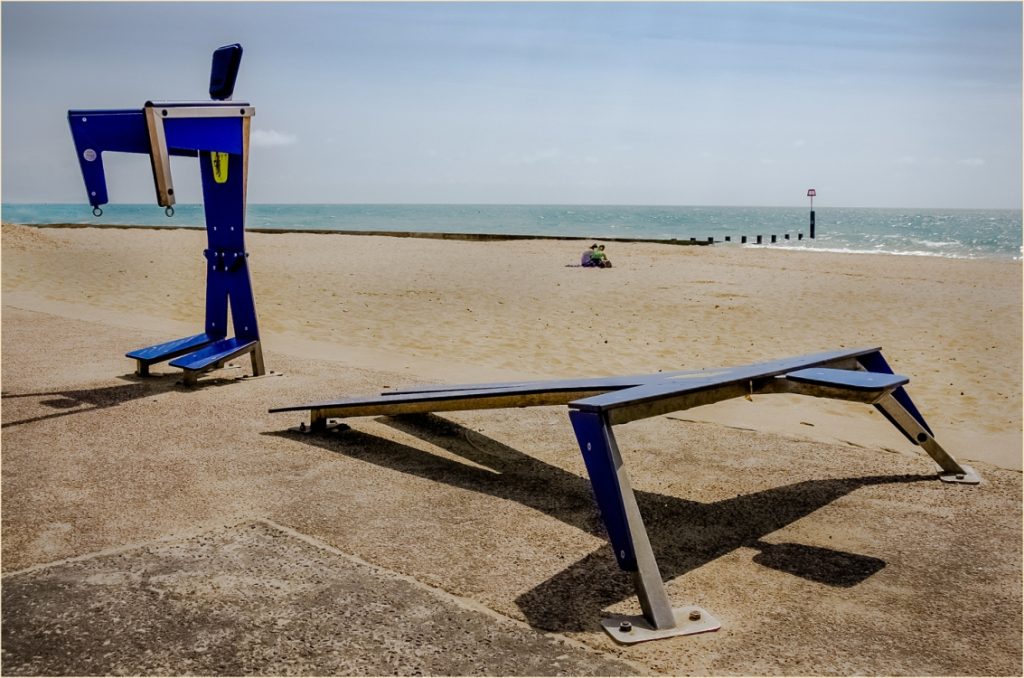
The third image scoring 9½ points was ‘Seaside exercise’ by Alfred C, shown below. David’s comments were that this was a simple but effective image, well seen and well captured especially with the impact of the shadows. He did feel the framing was too tight on the left hand margin where cutting off the full shadow.
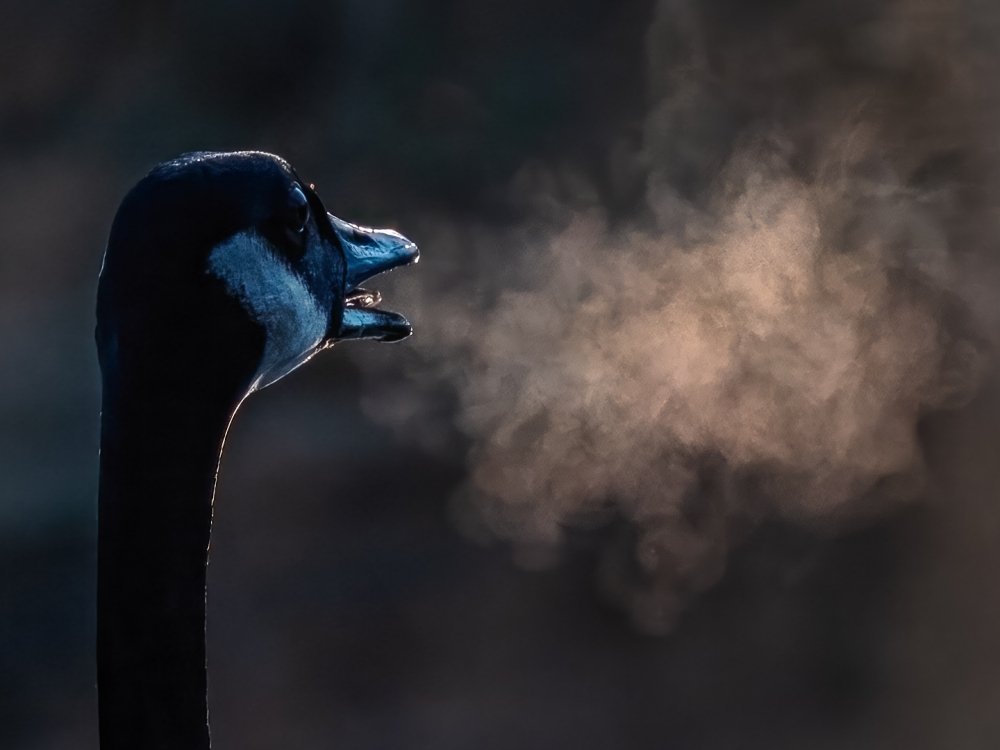
The fourth image scoring 9½ points was ‘Park dragon’, by Roshan R, reproduced below. Our judge liked the title of this image, which he said had been captured at the right moment. He felt that the birds breath being backlit worked well, and was thus successfully separated from the background. He did feel that the birds’ head was slightly too dark, as little to no detail was visible in this area.
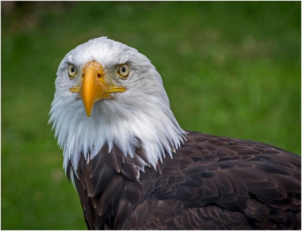
The fifth and final image scoring 9½ points was ‘Bald eagle’, also by Alfred C, shown below. David felt this bird portrait worked well, with good lighting and an effective background. He felt the slightly turned head was effective, and that the detail in the feathers was excellent. He commented that the processing was good, and had not been overdone.
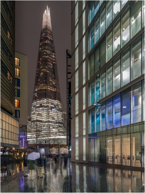
Our first image scoring 10 points was ‘The Shard from More London Riverside’ by Chris R, reproduced below. Our judge felt this was an excellent capture with a well balanced presentation. The reflections from the pavement worked well and contributed to the image. He felt that the fairly neutral coloured umbrella contributed to the picture both by not distracting, and forming a barrier between the camera and the people just beyond. Other people in the image were blurred through their motion, which was also effective in preventing distractions.
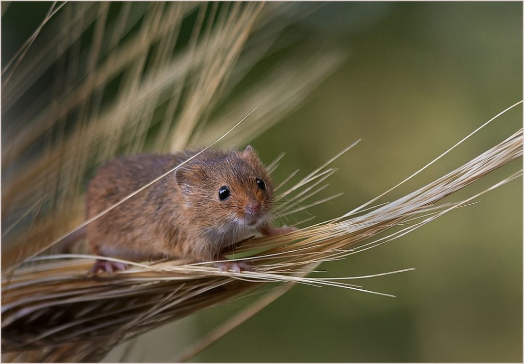
Our final image, and the overall winner scoring 10* points, was ‘Harvest Mouse’ by Mandy B. David described this as an excellent composition, with good lead-in lines from the wheat stalks. He commented on both the colour palette of the overall image, and the quality of the out of focus back ground. The mouse was sharp on the face and whiskers, gradually becoming softer over the body, with the tail still being discernible in the image.
Our congratulation go to all of our top scorers, and to our overall winners on the evening. In particular, our thanks to David Lloyd for his constructive critique throughout the evening
These are the final scores for the Open PDI competion this season, and they will be carried forward to the leader board. The winner in this finely balanced competition will be announced shortly.


0 Comments