On Wednesday 19th October, we had a fascinating talk from Caroline Preece. In her own words…
“The objective of the talk is to introduce to people a different way of thinking about photography and composition.
The first part of the talk covers photography as a visual language and communicating your personal take on the world through your images.
In the second part I aim to provide photographers with an understanding of the psychology behind how people interpret the visual elements within an image; and the impact of their compositional choices on the end image and how the viewer experiences it. This will help them communicate more effectively through their images; ensure their photos say what they want them to say and feel like they want them to feel, and enable them to create images with impact.
The talk is based on psychology and is about empowering people to make informed decisions as opposed to worrying about rules and whether to break them.”
https://www.carolinepreecephotography.com/
As Caroline states, as photographers, we can express what we want to say in our images and direct our viewers to look where we want them through our composition and post-processing.
This, of course, is nothing new. The world of design has always strived to use images as tools for communication by seeing photography as a visual language. We can feel more empowered to control the outcome of our work by working with the idea of taking our photos to share how we felt when at the location, rather than what we saw.
Caroline shared some of her main sources of inspiration:
EILEEN RAFFERTY: http://eileenrafferty.com/
Eileen can also be found on YouTube: https://www.youtube.com/watch?v=46KOBAs9oPE
DAVID DUCHEMIN: https://davidduchemin.com/
David is the author of many books that cover far more than just the technical world of photography. They can be found here: https://craftandvision.com/collections/all
MING THEIN: https://blog.mingthein.com/
ELLIOTT ERWIT: http://www.artnet.com/artists/elliott-erwitt/
ALASTAIR BENN: https://expressive.photography/
Caroline’s Section 1 was “RULES AND PHOTOGRAPHY”
Here, we opened with Bill Brandt’s quote:
Photography is not a sport.
It has no rules.
Everything must be dared and tried!
Caroline feels that we should aim to go beyond simple image-taking to become more creative and convey the feelings of where we are to the viewer. She demonstrated this with the World Press Photography winning image “Straight Talk” – Creator: Yasuyoshi Chiba | Credit: AFP via World Press Photo.
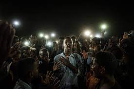
Here, we can feel the emotion and tension in the way this image looks. Who would guess it is taken at a poetry reading event?
Following this wonderful image, we were challenged about how we can create an impact with our work and Caroline showed us her “Rush Hour” image, taken on London Bridge. Here, Caroline has given us, her audience, a real sense of the movement of the commuters and a feeling of anonymity as they all head, herd-like, to their jobs.
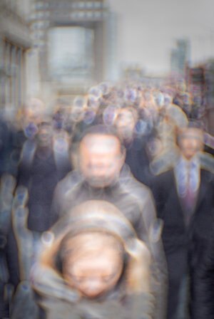
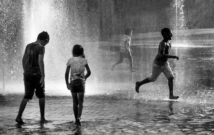
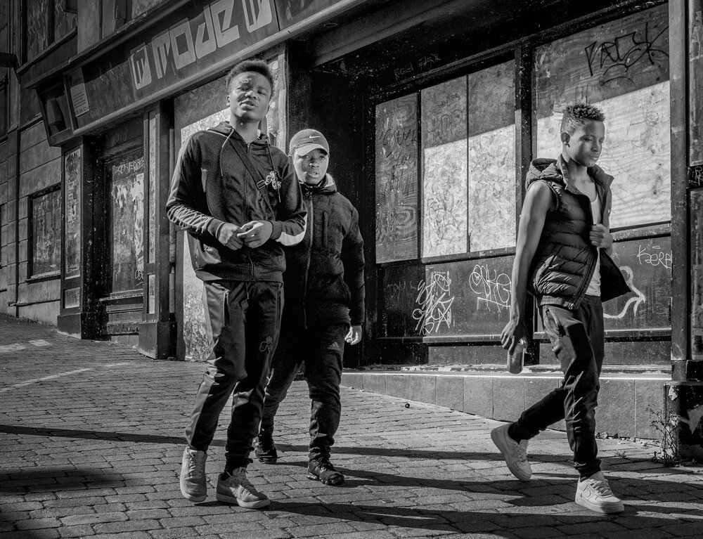
The question then is “What do want the viewer to look at in the landscape?” Caroline hit the nail on the head when she said that it is not possible to do street photography if you are not interested in people. For herself, she gets involved through overheard conversations and uses them as an insight into how she can create something different. By using different crops and/or perspectives, she knows that we can make our images stronger and say more; an example being contrasting images of three boys – the first sees boys enjoying playing in some fountains, happy to run and get wet on a hot day. The second has three other boys just walking but by skewing the angle of the image, we immediately have more tension: the three look in control and confident in their surroundings.
As we should all know, post-production can make the image reflect what you think. To be able to make your work more reflective, Caroline takes the view that we need to be part of our image; make it our own and it can say want we want it to, rather than be another generic piece.
Primarily, take what attracts you but you can work closer to home as well to do this.
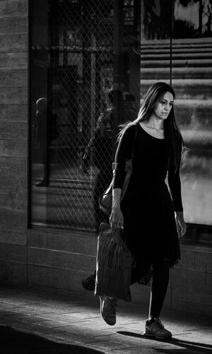
In this next image, Caroline has caught a shopper in Westfield. Look at her expression. I think that says it all!
As a guide to planning our photography, Caroline set out some further tips to help us make our work have that extra impact. These follow three areas:
- Take
- Select
- Post Production
Ask yourself:
- What do I see?
- What is the mood?
- What do I feel?
- How do I show my viewers what I want my viewers to see?
- What do I eliminate to make the above?
Remember; we can control the view, the subject and the environment in which we both take our work and in how the finished piece is seen and understood.
Section 2 was on Psychology. Here, Caroline gave us many examples where our brain has done the work for us in finishing the image we see by filling in the gaps. We all have taken or seen images that might not have the whole of the subject in the frame but in so many cases, it might not be important as, by not being there, the viewer is doing the work for us as the brain will know what should be there – this all adds something different to the image.
Caroline added a very good point about the leading lines – why must they be to the subject? Why not let them take the viewer to where you want or to an imaginary point that the viewer’s brain will see, even if it is not in the actual photograph?
In other words, get the viewer to fill in the blanks!
Some further tips are:
- Use similarity to make the image stand out.
- Mono can help with getting the viewers’ connection by simplifying the result.
- Separation is the key to using depth of field.
- Work with light and dark.
In the final Section 3, Caroline looked at visual elements. By way of an example, she had noticed that for many of the charity donation calls on TV, the first part of the production has been shot in colder colour tones, making what we see look more uneasy on the eye. Once the pitch for the donation is made, we see the mood lift using warmer, redder tones, to make us feel happier.
The visual elements we have in our frame also make a huge difference. We have all heard the judge say that “…well this is what you have chosen to show me”, which we usually interpret as an “uh-oh” moment. But Caroline simply says that we need to take care in what we include and exclude from our final image – less will always be more in terms of the number of elements in the photograph – the classic “It’s too busy” leaps to mind here! Remember, if you include everything, it’s going to be assumed you did this on purpose
More tips here:
- Make the change to increase the impact…crop!!
- Think about how the eye goes through the image. Visual weight and hierarchy lead the viewer so work to set these in the frame by using saturation with the right warmth and colour. this next image is a great example – using strong colours and placement, even through rain-covered glass!

- Use the light or in post-production create it to draw the eye.
- Martin Parr’s “Last Resort” demonstrates drawing the eye where he wants you to look.
Create Visual intensity energy in the image.
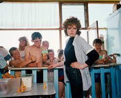
- Reflect the mood you want to show and what you want to say.
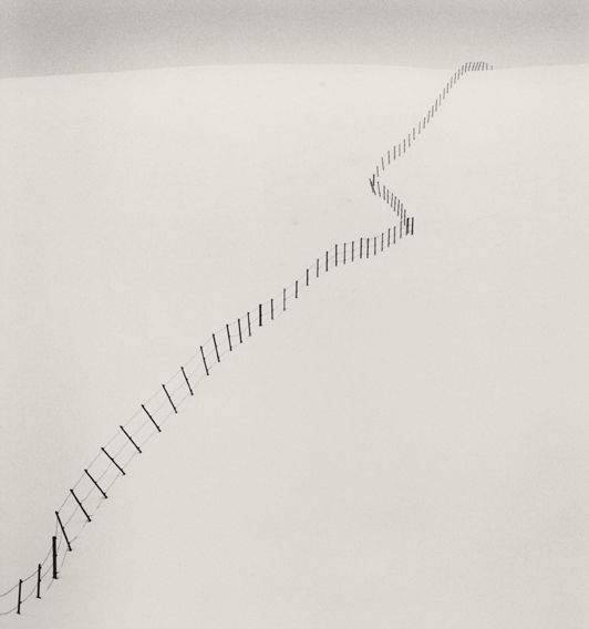
- Use Diagonal lines as they create more tension than usual but be wary of placement and impact – see Michael Kenna’s Fenceposts as an example.
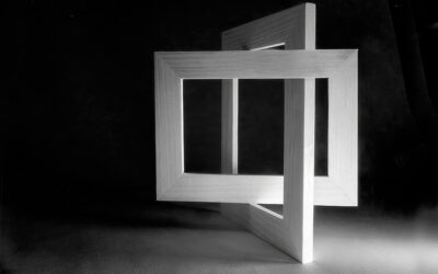
- Explore and play “sketch” images in your mind or with your phone camera – see Jet Black Squares!
- Use a tall frame with emphasis on height and size and exclude what you don’t want.
- The landscape aspect is movement and scale – safe and stable.
- Portrait gives a more intense dynamic – tall and less secure.
- Control the intensity and tension.
- Avoid repetition. Avoid repetition.
- Think of your subject or interest placement and why it is where it is.
if in the centre, it must interact with other elements but it needs balance; closer to the edge implies visual energy.
- You can leave off bits of limb! It adds that tension.
- The subject can be leaving the frame to add tension.
- The setting is important to the overall final image.
- Use of lines for different levels of energy in the image: horizontal is secure, permanent; vertical can fall; up and down: diagonal is more intense and unstable.
Well, we near the end so we ask, “What next?” Caroline has sent us the attached information sheet and offers us these final tips:
- Do More research.
- Take time to indulge in mindful looking at images – take in what is there and what you have let the photographer do to get you to look where you are looking.
- Make conscious choices when taking your images.
- Practice, practice, practice.
- Sketch images out when you can beforehand. Make yourself know what you want the result to be before you press the shutter.
To end, remember even the best photographers will only be happy with around 10 images a year so don’t expect great results. In the words of Martin Parr, we must all “Take more shit!”
Thank you.


0 Comments