It was our first Monochrome Print competition this week and the evening saw the welcome return to Photocraft of Pat Couder CPAGB BPE1* as our judge.
i think it is fair to say that many photographers think monochrome is “tricky” or “difficult” to work with. Pat did suggest that picking a suitable image for converting to mono can be hard. Often the range of tones might not work or the contrast is wrong. There is a school of thought that suggests editing a mono image shoud be done “in colour” – I recall Alfred C showing his technique which was like that – and I can understand that. With many cameras, the view can be set to mono so that one can visualise the outcome. Most editing software packages give several options and methods to convert, allowing for lots of experimentation. Silver Efex Pro in the Nik Collection is a favourite of many. I encourage you all to try and find some mono images through the many ways offered above.
Back in the hall – a different one for this last “in person” meeting till 2023, due to our usual hall being water damaged – we got underway to the sound of a police helicopter overhead. The noise was ridiculous but Pat pressed on.
Pat is a judge who gives very considered comments and critiques on all images, whether print or PDI (unlike some we know) and she certainly had time to do this as we sadly only had 17 images entered. I think that is a real shame.
However, Pat immediately said that, whilst it would have been great to have more, we were offering her a wide range of styles and genres to consider and each of the 17 were given time and thought by Pat.
One refreshing comment Pat made was that, whilst there has to be some technical input in how she is judging, her main method is based on how an image makes her feel. “Will I be thinking about this image on the way home?” she asks herself. With the range on show, I think she was spot on in pretty much all her comments and scores.
Many images had large areas of sky and Pat took time to study these as it is often the case that mono printing brings artefacts or dust spots more into view. There were a few to be seen but none that caused her real concern. We also had some of the usual “perhaps better cropped” comments and again these were mainly relevant.
We also saw more than one style of monochrome with infra red, sepia and other tones used apart from just black and white. These helped add “mystery” and “impact” making the viewer take time to look. There were many good “rich blacks” and sharp images – some, though, being a bit overdone in that area. It can be hard to resist pushing sliders too far right when sharpening and the simple solution is to make a copy layer where you can add the sharpening only where it is needed – e.g. the sky should not be sharpened.
With just the 17 prints, Pat gave us her thoughts on all before our break and then marked them afterwards, allowing for some further comment and conversation.
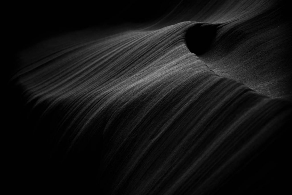
Our worthy 10+ winner was Mark B – taking his first steps into mono print. Well done Mark for his excellent “SANDSTONE CURVES”. This was taken in Slot Canyon, Arizona and Pat loved the feel of movement and the curves. “A Fine Art Print, very effective and considered” were some of her comments.

Our other 10 of the night came from David P with “Peripateticus” Pat said she could look at this for ages, it is so intriguing. it is one of those images that everyone will see something different in. Pat was seeing “mouldy tomatoes”, “birds” and many other shapes. David explained that this is simply condensation inside a polythene bag above a seed tray. With a 1 cm clearance, it must just be the droplets rolling within the bag but it gives the impression of something moving around, leaving a trail. His title comes from the word Peripatetic, meaning to wander. Me? I see a camel.

Our other held back images were:


Well done to all of the above and to Mark for two high scores. It was interesting to hear him try and explain that he is “not comfortable” with mono to Pat – she was amused!
A big thank you to Pat for giving us a fine evening and some great coments and insights.
One final postscript from me. Just 17 prints!? Only six of us entered!? You all know I love print; to me it is how an image should be seen, not on a screen. I would really like to know why there is such a drop off in numbers – only 19 for our open print 1 as well. There are many routes to printing – supermarkets, high street shops, online. It is not about having to spend money on the printer, paper and ink – of course, you can if you want – but I am left puzzled why more do not want to see their “best” work in print. It adds so much and there is a great feeling to be gained by holding an image you have taken in your hand rather than seeing it hunched over a phone or a computer screen. Please, let’s get our numbers back up for 2023. I am happy to help anyone in this – it is not very hard to set up and as I say, many ways to print for very fair cost.

